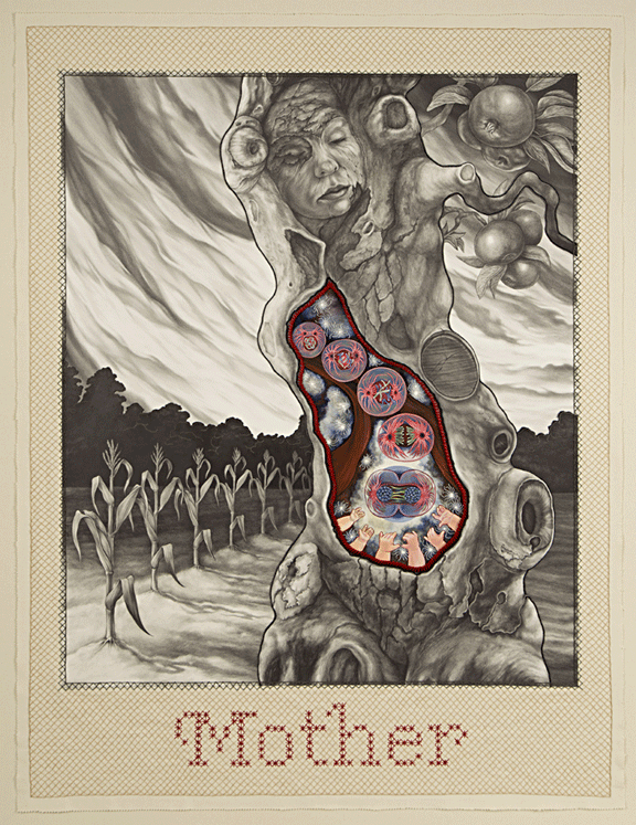
So… after months of drawing, painting, sewing, and beading, I am happy to be nearing the end of my current drawing with only a few milliliters of blood here and there (thanks to sewing needles and X-actos), and only one major mishap. For the most part, it has come together beautifully….
Ah, the best laid plans of mice and men. Apparently, paper is not always as predictable as I want it to be and can have a mind of its own, so one of the last steps of my drawing fell to pieces – or, rather, it did not work as well as it should have, so I tore it to pieces – and I had to rethink on my feet. Fortunately, my two favorite studio pastimes are 1) drawing and 2) figuring out a problem, so the mishap turned into a breakthrough.
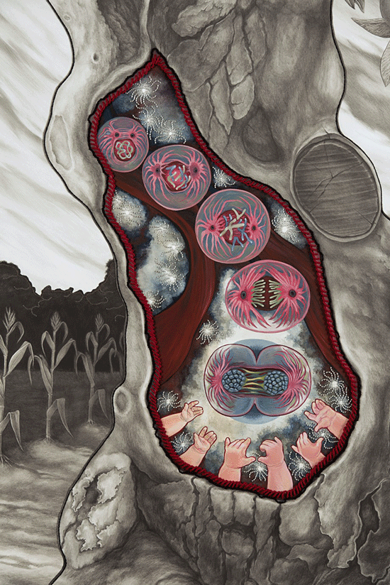
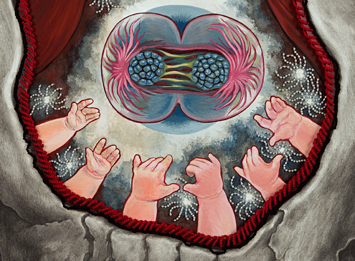
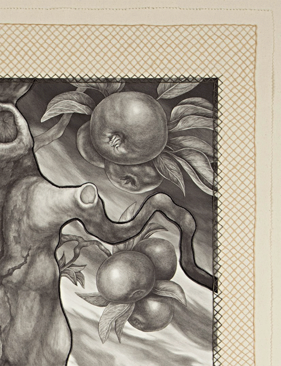
I am really enjoying the process of finishing this piece, but I am resisting the urge to post full pictures until the piece is done (there could always be another mishap). In the meantime, here are some snapshots of the beading and stitching throughout parts of the drawing (click to see these pictures larger):


The good thing about working with paper is that if my current solution does not work, I can always tear it apart and start again.
...
The False Mirror show at Artworks in Trenton continues through this Saturday, February 22. Here is a review of the show.
...
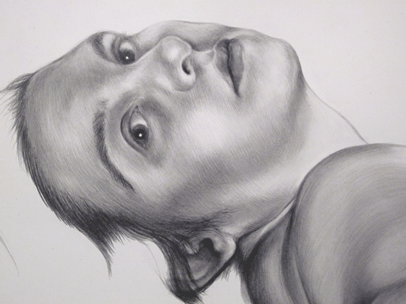
And, lastly, a Strange Tale that was completed in December, "Equinox" graphite on Moleskine sketch paper, 8.25 x 10.5 inches:

The higher quality jpeg is on flickr.
Well, here’s to the prospect of finishing a drawing and being very thankful that I do not work under deadlines…hopefully I will be posting the completed drawing soon.